
The Problem Is Always the Same
At every company I’ve worked at, the design-to-engineering breakdown looks the same when you arrive: designers working in isolated files, engineers rebuilding components from scratch in parallel, prototypes that don’t match what ships, and requirements written against mental models only one side of the table shares.
Insight
The gap between prototype and shipped product wasn't a quality problem — it was a vocabulary problem. Designers and engineers were making the same product from different references, with no canonical source either side fully trusted.
Hypothesis
If both disciplines built from a shared source — same token definitions, same component specs, same interaction states — the interpretation gap at handoff would close, and so would most of the rework it caused.
Decision
Treated the design system as shared engineering infrastructure, not a designer deliverable — a joint artifact both sides owned and built against, not a spec one side handed to the other.
The causes vary — a team that grew fast without establishing conventions, product lines that built independently, a brand team that never talked to the product team. But the symptom is consistent: friction at every handoff, slower delivery than the work should require, and a gap between the quality of what was designed and the quality of what shipped.
Building a design system was the solution at Cylance, ActZero, and BlueVoyant. The approach was the same each time. The tooling evolved with the industry. The underlying pattern held.
Cylance — Establishing the Foundation
When I stepped into the Director of UX/UI role at Cylance — the first director in that position — designers were producing good work in isolation. Each designer had their own Sketch files. The product and marketing teams had developed separately, with no shared visual language. Engineering was quietly rebuilding similar components for different parts of the product because there was no canonical reference to build against. The result was a product that felt slightly off in ways that were hard to articulate — inconsistent spacing, mismatched type treatments, components that looked related but weren’t identical.
The first move was to establish what the brand surface actually was. That meant working with marketing and branding to resolve the disconnect between how the product presented itself externally and how it presented itself in product. Those two things had been optimized independently and needed to converge into a single visual standard before either could scale.
The result was the Confidence Design System — a unified design library structured as a deliberate hierarchy: Principles at the top, then Basics (typography, color, spacing tokens), Components, Templates, Features, and Applications at the bottom. That structure was intentional. The system needed to answer questions at every level of specificity — from “what’s the correct border radius for a card?” at the component level to “how does an alert escalation flow?” at the feature level. A flat component library can’t do both.
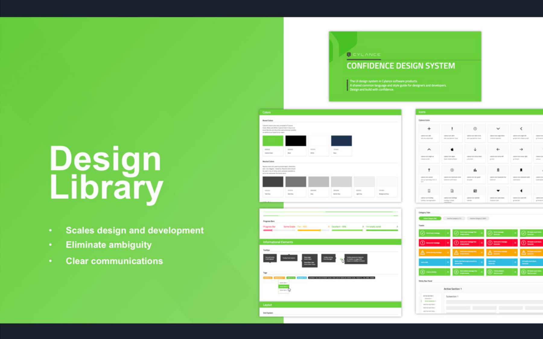
The system served two very different product contexts simultaneously: the enterprise SOC console, designed for security analysts running investigations, and Smart Antivirus, the consumer product designed for households with no security background. That both contexts drew from the same foundation — the same color tokens, the same spacing scale, the same component definitions — was the design architecture decision that made the 33% handoff improvement possible. Not a metric we targeted; the natural outcome of removing the interpretation gap between what was designed and what was built against.
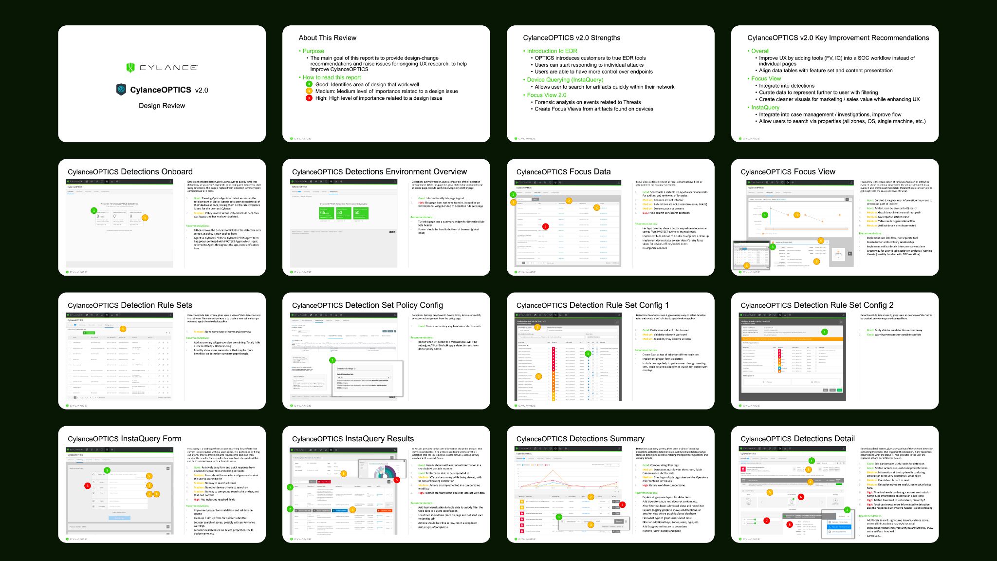
The design review artifact above shows the system in use: annotated production screens assessed against the library standard, with specific improvement recommendations grounded in a shared definition of correct. That kind of review is only possible — and only meaningful — when there’s a canonical reference both sides agree on. The enterprise console case study shows the customer-facing outcome; this section shows the infrastructure that made coherent output possible across enterprise and consumer surfaces.
ActZero — Speed as a Constraint
At ActZero, the design system was infrastructure for a compressed timeline rather than a correction to existing fragmentation. We were building the first customer portal from scratch in nine weeks, with a small team and a parallel engineering build. There was no existing component library and no margin for the kind of rework that inconsistency produces.
The foundation was built before the product. Brand standards came first — color palette, typography scale, and the visual identity that would carry across the marketing site, customer portal, and all product surfaces simultaneously.
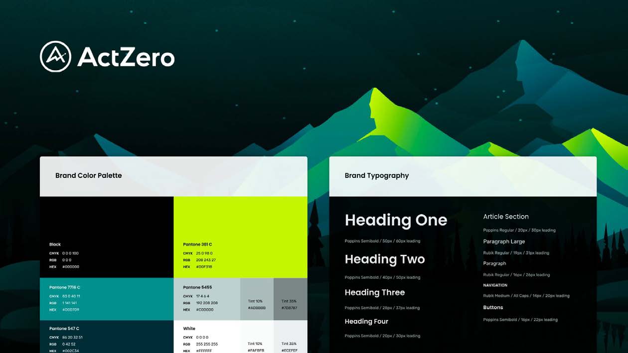
The approach was to establish the system before building the product — defining the token layer (color, spacing, type), the core component set (buttons, inputs, cards, data tables, badges, status indicators), and the interaction patterns that would recur across every surface. The portal’s dashboard, escalation views, maturity gauges, and reporting surfaces all drew from the same source. Engineers built against what designers had defined, and the prototype matched what shipped closely enough that there was no “translation” step in the handoff.
The security assessment feature, added in a subsequent cycle, extended the same system rather than starting fresh. The maturity gauge, the control domain breakdowns, the filter chips and status badges — all of it composed from components already defined and already implemented. That reuse was only possible because the infrastructure had been built deliberately at the start rather than accumulated incrementally.
BlueVoyant — Alignment Across Independent Teams
At BlueVoyant the challenge was different again. Design had been outsourced; when I arrived as Director, Product Design, the company needed a common language to deliver products and services at scale through digital transformation. Multiple product lines — MDR, Supply Chain Defense, digital risk protection — each had its own engineering team and front-end stack. Customers experienced one brand name and three disjointed portals.
The brand direction reinforced the product structure. Voyant — seeing clearly, forecasting from wide-ranging data — paired with the scale of blue suggested a platform that cast a net and helped customers build a blueprint for their cybersecurity practice: tools and framework provided, details filled in over time with BlueVoyant’s help. The design system and UI Guidelines were how that metaphor became buildable — one token layer, one dashboard grammar, one set of principles across every surface a customer touched.
The teams weren’t resistant to better practices — they were unaware of how design and engineering could operate differently. The model they knew was designers producing specs and engineers interpreting them. A shared Figma source both sides built against was new. The portal case study shows the customer-facing outcome; this section shows the infrastructure that made coherent output possible across squads.
The resolution was the same formula, applied with modern tooling and formalized into a written standard. The BlueVoyant Product UI Guidelines — a 30-page specification covering design principles, application framework, semantic color system, token-based theming, and UI patterns — was the artifact that made alignment tangible. Any designer or engineer, regardless of which product line they sat in, could build against the same reference.
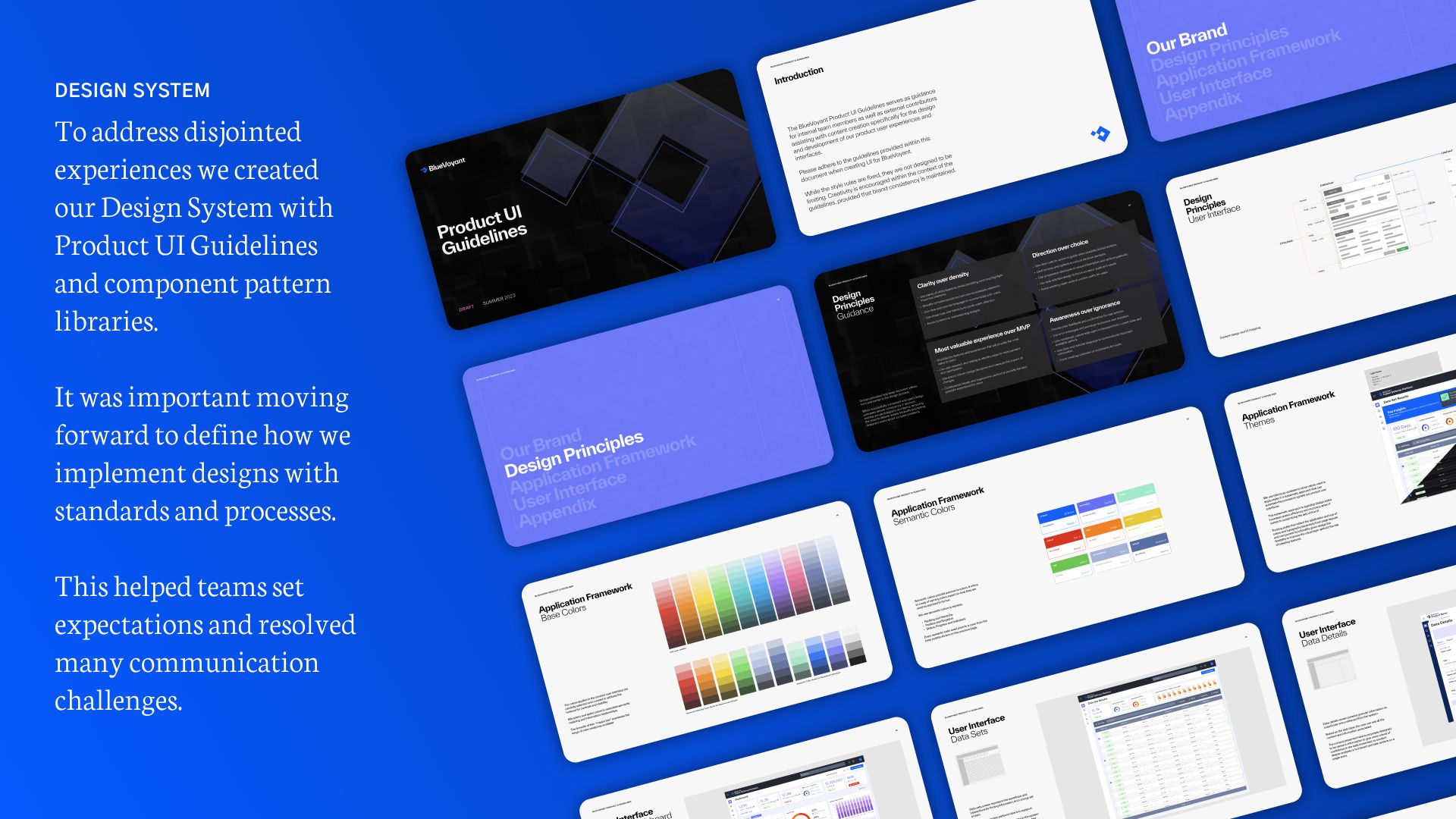
The document’s scope extended beyond product UI to reports, email notifications, and documentation — every surface a customer would encounter. That breadth was the point: if the design system only applied inside the product portal, the coherence would break at the moments customers needed it most.
The resolution was also to establish a shared Figma library that both designers and the dedicated front-end engineering team contributed to and built against. Component definitions, interaction states, spacing tokens, and pattern documentation that engineers could implement directly. The dedicated front-end team — isolated specifically to own UI implementation — became the bridge that kept the system alive across product lines that would otherwise have continued diverging.
The Pattern Across Three Companies
The tooling changed — Sketch to Figma, internal wikis to dedicated documentation platforms, loose style guides to token-based systems. The underlying pattern held across Cylance, ActZero, and BlueVoyant.
At each company the entry condition was the same: designers working in isolation, engineers rebuilding from scratch in parallel, and a gap between what was designed and what shipped. The cause varied — a team that grew fast, product lines that built independently, a brand team that never connected to product. But the symptom was consistent enough that the diagnosis was never in doubt on arrival.
What changed across the three applications was what the system had to do beyond component consistency. At Cylance, the system needed to serve two completely different product contexts (enterprise and consumer) from a shared foundation — the architecture decision that made the 33% handoff improvement hold. At ActZero, speed was the constraint: the system had to be established before the product existed, with no room to retrofit conventions after the fact. At BlueVoyant, the challenge was political as much as technical — getting three independent engineering teams to adopt shared infrastructure when each had built its own conventions required the system to earn trust, not demand compliance. The dedicated front-end team was the organizational structure that made adoption possible.
The formula is stable: find the disconnect, identify the missing shared vocabulary, build the infrastructure that makes both sides speak the same language. The hard part is never the component library. It’s changing how the organization around it operates.
What a Design System Actually Does
The tangible output — a Figma library, a component spec, a token file — is not the point. The point is what changes in the organization around it.
Requirements become precise because designers and engineers share a vocabulary. Prototypes earn trust in stakeholder reviews because they’re built from real components, not approximations. Engineers work faster because canonical patterns exist and edge cases have already been considered. Designers spend less time in review cycles correcting implementation drift. And the product that ships is recognizable as the thing that was designed — which sounds like a low bar until you’ve worked somewhere that doesn’t clear it.
The design system is infrastructure. Like any infrastructure, its value is most visible when it’s missing.